![]()
Sponsored By
ROCK
HARDWARE
Chockstone Photography
Australian Landscape Prints |
 Chockstone Forum - General Discussion
General Climbing Discussion
| Author |
|
|||||
10:34:45 AM |
Data below (blue spots) is monthly global temperature data taken from Hadley Centre / UK Met Office / IPCC. Red lines show temperature trends. Data is over a 30 year period for each graph. One graph is the past 30 years. The other graph is for a much earlier 30 year period, before the major increase in man's CO2 output. ( I hope that is explicit enough ?) Possible responses: a) Left graph shows greatest warming b) Right graph shows greatest warming c) There is no discernable difference in the rate of warming over the past 30 years and the much earlier 30 year period. 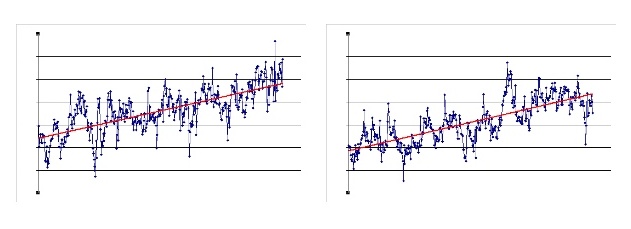
|
|||||
10:46:55 AM |
Without any scale on the two graphs you can't make any comparison. They could be orders of magnitude different, they could be exactly the same. Also, do you have any data that shows the standard deviations from the trend lines? |
|||||
10:48:34 AM |
On 29/05/2009 TonyB wrote: >Data below (blue spots) is monthly global temperature data taken from Hadley >Centre / UK Met Office / IPCC. Red lines show temperature trends. Data >is over a 30 year period for each graph. One graph is the past 30 years. > The other graph is for a much earlier 30 year period, before the major >increase in man's CO2 output. ( I hope that is explicit enough ?) I'd love to know the formula for the regression line as well. That's pretty important. Also, I don't consider 30 years long enough to make many statements WRT the climate. |
|||||
1:55:35 PM |
Stepping back to that earlier bit about whether climate change is killing people and is it distracting us from addressing other more immediate issues, I found this today. | |||||
4:53:31 PM |
On 29/05/2009 ajfclark wrote: >Without any scale on the two graphs you can't make any comparison. Both graphs have the same scale for abscissa and ordinate (X and Y axes) >Also, do you have any data that shows the standard deviations from the >trend lines? This site gives a detailed discussion of the data accuracy http://www.surfacestations.org/ |
|||||
5:02:17 PM |
On 29/05/2009 evanbb wrote: >I'd love to know the formula for the regression line as well. Slope = ( n ∑(x.y) - ∑x.∑y ) / ( n∑(x.x) - ∑x.∑x ) |
|||||
5:49:57 PM |
On 30/05/2009 TonyB wrote: >On 29/05/2009 evanbb wrote: >>I'd love to know the formula for the regression line as well. > > Slope = ( n ∑(x.y) - ∑x.∑y ) / ( n∑(x.x) - ∑x.∑x >) That is not a particularly informative equation. Can you give use two seperate equations (one for each line) of y=ax + b or equivalent. that will give us the actual slope of each. also i would like an r2 for both lines (if you have enough data). this doesnt retract from what EB said. 30 year periods really cant be justified for this stuff. if you plot the 30 years prior to and including 1999 what do you get? |
|||||
3:24:42 PM |
On 29/05/2009 TonyB wrote: >Data below (blue spots) is monthly global temperature data taken from Hadley >Centre / UK Met Office / IPCC. Red lines show temperature trends. Data >is over a 30 year period for each graph. One graph is the past 30 years. > The other graph is for a much earlier 30 year period, before the major >increase in man's CO2 output. ( I hope that is explicit enough ?) > >Possible responses: > >a) Left graph shows greatest warming >b) Right graph shows greatest warming >c) There is no discernable difference in the rate of warming over the >past 30 years and the much earlier 30 year period. > > Homework for this week: Go to your maths textbook and look up the formula for the confidence interval for the difference in slopes. Then re-write your posts on this subject. Additional homework related to previous posts: Look up sea level data for the last century. (arguably better than surface temperature measures) Then re-write your previous posts on polar ice and rates of temperature change. (remember to allow for thermal expansion of sea water in your calculations) Amend your posts to include other green house gases, particularly methane and nitrous oxide. Look up when the current rises in atmospheric levels of these began (hint: not long after the industrial revolution) Amend your comments on temperatures in the last decade by including consideration of the SOI (+/- atmospheric particulate pollution) Re your suggestion that increasing greenhouse gas levels are the result of cyclical warming (melting of tundra etc) rather than a cause of it, explain why previous cyclical warming of the earth did not result in high greenhouse gas levels. You mention very high levels of CO2 early in the earth's history. Add comments about whether these levels were compatible with human life. CO2 levels since 1960 exceed levels seen at any prior time since humans evolved. Given that humans have never lived on a planet with 0.06% CO2 , what do you predict the long term effects will be, if CO2 reaches that level? Home work is due Friday week your teacher (ps I will definitely not be responding to any human evolution skeptics) |
|||||
9:19:01 AM |
It seems my quiz has brought this thread to a grinding halt. The slope lines are standard linear regressions if anyone doesn't recognise the formula. As our railway engineer friend who heads up the IPCC said in Sydney in October last year "warming is taking place at a much faster rate". Now a government representative wouldn't state such a blatant lie would he ? ... and we all trust our pollies too don't we ? One graph is the last 30 years and the other is a period before the large increase in man's CO2 emissions. IPCC data. Same scales. Which one shows "unpredented" warming? Perhaps this really is the greatest political scam of the century ? |
|||||
11:30:12 AM |
because we are bored with your graphs. and you can't answer simple questions like giving us the actual formula for both lines in y = ax + b so we can make some kind of judgement. and i suppose this is done on the raw data because the "adjusted" data is a crock aimed at furthering the CC scam. man, talk about making me skeptical of CC skeptics!  |
|||||
12:02:48 PM |
On 1/06/2009 TonyB wrote: >It seems my quiz has brought this thread to a grinding halt. > > It's your beaut graphics Tony. I had to go and get some help analysing them. I'll give you the benefit of the doubt, and call that a theory. Now like any good scientist, it is my duty to seek a result that disproves your theory and advances science. I think the hypothesis is "because the rate of warming now is the same as it was before, there is no Anthropogenic Global Warming." Or is it that the rate isn't increasing? So since the rate of change is not changing, the guy from the IPCC, (who is apparently a railway engineer and thoruoghly less qualified than a software salesman) is wrong, and since he's wrong, the whole thing is a sham and AGW is a fallacy. So, what would disprove this theory? I reckon a graph of the averaged/normalised global temperature over a longer period, or to disprove the second theory, a first derivative (rate of change) of the same graph. How about this one? 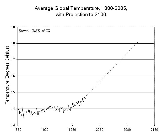 I mostly chose this one because it's less than 40kb, and because it goes up at the end. There you go. Disproved. Failing that, here's a picture of a polar bear. This proves global warming exists:  |
|||||
1:03:58 PM |
Ok, Tony's graphics have convinced me ... so much so I've created another one to help the cause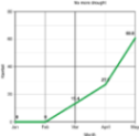 This is our rainfall for the year so far. As you can see, it's gone up immensely in the last 3 months, unequivocally demonstrating that the drought is over and climate change must therefore be a furfy. Or then again, is 2 mondays of constant rain in a row demonstrative of climate change? I'm so used to it not raining I can't remember what's normal anymore. Maybe I can come up with a graphic demonstrating the relationship between Mondays and rainfall? The universal gloom of returning to the real world after a weekends climbing on a Sunday night is sufficient to create a large scale depression leading to likely rainfall on a Monday??? This is from a DPI (a very radical bunch of leftist anticapitalist hippies) report in March this year (my emphasis). Rainfall Very little rain has fallen for the past ten weeks. Many places received no rain during the entire month of February including Echuca, Terang, Mildura, Kyabram and Avoca (Figure 1). Melbourne received only 3 mm for the month. Victoria has experienced its second driest start to the year on record (Bureau of Meteorology, Drought Statement, Feb 4). This is a continuation of the very much below average rainfall over the last 21 months. The Indian Ocean Dipole (IOD) is a pattern of sea surface variability across the Indian Ocean that is associated with lower than normal rainfall over central and southern Australia when it is in a positive phase. Both 2007 and 2008 were consecutive years of sustained positive IOD. The IOD usually has its greatest impacts between June and November. The combination of record heat and widespread drought during the past five to ten years over large parts of southern and eastern Australia is without historical precedent and is, at least partly, a result of climate change. Temperature The very dry and warm weather that prevailed across Victoria during the second half of December and throughout January, continued during February. Daytime temperatures were 1-3°C degrees above normal and overnight temperatures were 0.5-1°C above normal. An exceptional heatwave affected Victoria during late January and early February (28-31 January and 6-8 February). Hopetoun set the all time state record temperature of 48.8°C on February 7. The Hopetoun temperature is also believed to be the highest ever recorded in the world so far south of the equator. Many other places recorded their all-time record maximum temperatures including Walpeup (48.1°C), |
|||||
9:17:39 AM |
The debate is over. All questions global warming were answered on South Park last night. Or just watch it here: http://southpark-zone.blogspot.com/2008/01/s9-two-days-before-day-after-tomorrow.html Ha ha. |
|||||
9:23:26 AM |
This is a pretty funky tool. http://data.giss.nasa.gov/gistemp/maps/ I used it to generate this map: 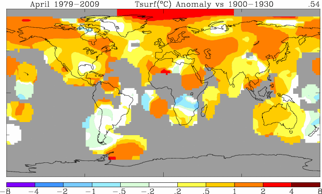 So, this is a map of the difference in average temperature for the period 1979-2009 (last 30 years) when compared with the local average temperature for the 1900-1930. Make sense? Anywhere orange has a higher local average temperature for the last 30 years than they did for the 30 years at the beginning of the 20th Century. Then, for extreme funkyness, there's also a graph of temperature anomalies compared to lattitude: 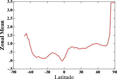 I'd be interested to see what combination of years would be required to show average global cooling? Also, I recommend against investing in North Pole realestate, or polar bears in the next few years. |
|||||
9:28:21 AM |
Come on all you alarmists out there. My quiz can't be all that hard can it ? Isn't anyone going to try to answer ? My graphs show the "BEFORE" (man's increased fossil fuel burning) and the "AFTER" (increased fossil fuel burning). Which is which ? If you can't see any significant difference between them, remember there is the "(c)" option ... that is, there is no evidence that man's CO2 is causing increased global warming !! |
|||||
10:08:33 AM |
On 2/06/2009 TonyB wrote: >Come on all you alarmists out there. My quiz can't be all that hard can >it ? Isn't anyone going to try to answer ? > >My graphs show the "BEFORE" (man's increased fossil fuel burning) and >the "AFTER" (increased fossil fuel burning). > >Which is which ? > >If you can't see any significant difference between them, remember there >is the "(c)" option ... that is, there is no evidence that man's CO2 is >causing increased global warming !! Ahh, Tones, check your computer. You don't seem to be receiving replies on Chockstone. Could be a Driver problem? Is the ropey thing plugged into the funny shaped hole in the wall? Your 'quiz' was refuted by 4 different posters, and I reckon the nice pictures in the post above pretty much put the nail in the coffin as well. |
|||||
10:40:44 AM |
On 2/06/2009 TonyB wrote: >Come on all you alarmists out there. My quiz can't be all that hard can >it ? Isn't anyone going to try to answer ? Bloody hell Tony. Give us the equations for the lines in y = ax + b. Can't be that hard can it? Or does it show that slope of the line for the last 30 years is actually greater than the previous.......is the need hide somehting the reason you are not giving this information. |
|||||
10:58:24 AM |
On 2/06/2009 evanbb wrote: >This is a pretty funky tool. >Anywhere orange has a higher local average temperature for the last 30 years than they did for the 30 years at the beginning of the 20th Century. & >I'd be interested to see what combination of years would be required to show average global cooling? I'd be interested in knowing why those orange areas appear in isolated locations over the sea, particularly SSW of Gt Aust Bight. Also why some areas are still grey like Indonesia/Borneo. I am an interested bystander of sorts to this whole debate and don't have much to contribute, but am still interested in the outcome/s. For my 2c I do know that modelled data is only as good as the data it is based on & I have noticed that computer software can 'clean up' data considerably, to spit out results that are impressively inaccurate! ... This shouldn't stop us from doing the right thing anyway, even if there is a personal cost involved. |
|||||
10:59:14 AM |
On 2/06/2009 TonyB wrote: >Come on all you alarmists out there. My quiz can't be all that hard can it ? Isn't anyone going to try to answer ? Tony, to me the variations from the trend line on the recent 30 years graph looks much greater. Even the variation from the trend line within the the recent 30 year graph looks much greater in recent times than 20 years ago. To me your graphs seem to indicate that the data shows destabilisation of the climate. Do you have any data on the standard deviations for these two data sets? A box and whiskers of each of the two data sets side by side with the same scale would also be good. |
|||||
11:18:45 AM |
Righto Tonestar. Here is my answer to your quiz. Lets take trip back to when you posted this. >>On 19/05/2009 TonyB wrote: >Here is the data used by IPCC, from Hadley Centre / UK Met office for >anyone interested in tracking the current global cooling trend. >http://www.cru.uea.ac.uk/cru/data/temperature/crutem3gl.txt >I've written an Excel macro to make plotting easier if anyone wants it. > So this data is by your admission credible. Below is a plot. Unlike you I will be forth coming with all details and to make it easier for others to judge what is going on I have plotted them both on the same graph (surely you could manage that!). The blue line is monthly anomalies taken from the web site above from 1969 to 1999. The red line is the same taken from 1900 to 1930. Which line has the greatest slope? Where is the temperature rising the fastest? 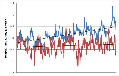 This graph proves two things - 1) anyone can cherry pick your way to 'conclusive' evidence and 2) I dont need to look at the adding pictures lnk to post pictures in an online forum anymore. So, to sum up. Your quiz was sh!thouse, you failed to provide any additional information that was requested so people could actually make a judgement and it has been rebutted in several posts. End of quiz. How about we get back to EB's challenge to you. What do you need? |
| There are 818 messages in this topic. |
Home | Guide | Gallery | Tech Tips | Articles | Reviews | Dictionary | Forum | Links | About | Search
Chockstone Photography | Landscape Photography Australia | Australian Landscape Photography | Landscape Photos Australia
Please read the full disclaimer before using any information contained on these pages.
Australian Panoramic |
Australian Coast |
Australian Mountains |
Australian Countryside |
Australian Waterfalls |
Australian Lakes |
Australian Cities |
Australian Macro |
Australian Wildlife
Landscape Photo |
Landscape Photography |
Landscape Photography Australia |
Fine Art Photography |
Wilderness Photography |
Nature Photo |
Australian Landscape Photo |
Stock Photography Australia |
Landscape Photos |
Panoramic Photos |
Panoramic Photography Australia |
Australian Landscape Photography |
High Country Mountain Huts |
Mothers Day Gifts |
Gifts for Mothers Day |
Mothers Day Gift Ideas |
Ideas for Mothers Day |
Wedding Gift Ideas |
Christmas Gift Ideas |
Fathers Day Gifts |
Gifts for Fathers Day |
Fathers Day Gift Ideas |
Ideas for Fathers Day |
Landscape Prints |
Landscape Poster |
Limited Edition Prints |
Panoramic Photo |
Buy Posters |
Poster Prints