![]()
Sponsored By
ROCK
HARDWARE
Chockstone Photography
Australian Landscape Prints |
 Chockstone Forum - General Discussion
General Climbing Discussion
| Author |
|
|||||
3:34:23 PM |
On 2/06/2009 IdratherbeclimbingM9 wrote: >I'd be interested in knowing why those orange areas appear in isolated >locations over the sea, particularly SSW of Gt Aust Bight. Also why some >areas are still grey like Indonesia/Borneo. I haven't looked through the method, but I'd guess it's just the locations of the measuring stations? Grey means no data. > >I am an interested bystander of sorts to this whole debate and don't have >much to contribute, but am still interested in the outcome/s. >For my 2c I do know that modelled data is only as good as the data it >is based on I wouldn't get too hung up on the modelling argument. It's straight from the handbook for causing doubt. Fact is, there's plenty of observational data now supporting the theory. Global Warming is not a new theory; Al Gore and his mates were working on it in the 70s, so in a lot of cases there's virtually 30 years worth of observations. I think the modelling argument is pretty weak; it doesn't overturn the glaring truth that the temperature has gone up. |
|||||
10:29:57 AM |
On 2/06/2009 GravityHound wrote: >On 2/06/2009 TonyB wrote: >>Come on all you alarmists out there. My quiz can't be all that hard >can >>it ? Isn't anyone going to try to answer ? > >Bloody hell Tony. Give us the equations for the lines in y = ax + b. Can't >be that hard can it? Perhaps you missed it, the slope, "a" in your equation, is: Slope = ( n ∑(x.y) - ∑x.∑y ) / ( n∑(x.x) - ∑x.∑x ) The intercepts will obviously be different in each graph and have no relevance to the rate of warming. |
|||||
10:35:57 AM |
On 2/06/2009 evanbb wrote: > Your 'quiz' was refuted by 4 different posters, "refuted" ? I saw some requests for more information ... which I have given. The question is quite simple ... which graph shows "BEFORE" and which shows "AFTER" man's increased fossil fuel burning. How can such a simple question be "refuted" ? No one has yet been bold enough to give an answer to my quiz. Fear perhaps ? |
|||||
10:38:10 AM |
Okay, the one on the left is before. How does this prove anything? | |||||
11:06:07 AM |
On 2/06/2009 ajfclark wrote: >Tony, to me the variations from the trend line on the recent 30 years >graph looks much greater. Even the variation from the trend line within >the the recent 30 year graph looks much greater in recent times than 20 >years ago. To me your graphs seem to indicate that the data shows destabilisation >of the climate. These "variations" from the trend line are less than 0.4 degrees. Remember that temperature data is recorded to the nearest 1 degree (as the average of the max and min temps), although in some places measured electronically to 0.1 degrees. Despite this, "averages" of this data are calculated and recorded to 3 decimal places ! No wonder there's fluctuations ! Over 70% of stations have errors greater than 2 degrees with 11% having a 5.0+ degree error ! http://www.surfacestations.org/ . Lots of potential for fluctuation !! Hardly anything to suggest "destabilization" ... although falling temperatures are quite apparent in one of the graphs. There is nothing to suggest anything other than natural variation and measurement error. >Do you have any data on the standard deviations for these two data sets? No. However this site http://www.surfacestations.org/ is carrying out an on going investigation of data veracity. Another major issue in terms of data accuracy and variation are dramatic changes in the number of measuring stations. Add a stack of stations in the tropics and it will obviously effect the "average", even if the average is "corrected" by the IPCC's secret procedures. The number of stations fell by more than half in the late 80's, which surprise, surprise, showed a strong correlation with a rise in "average" temperature at that time. http://www.uoguelph.ca/~rmckitri/research/nvst.html There are some quite amusing accounts of older temperature measurement, before the advent of the Stevenson screen in the late 19th century. Any data prior to 1900 should be expected to have a very large error (despite the invention of the Six thermometer more than a hundred years before). More recent temperatures can be correlated with satellite and radiosond, which show slightly stronger recent cooling than the IPCC/Hadley data. |
|||||
11:42:40 AM |
I am absolutely flabbergasted that you continue to log in at 10:30 every day and post more easily disproven nonsense, then carry on your own little point scoring effort. You've made no effort at a cohesive theory or even a decent argument at any stage; you seem content that if you can find an error, any error, in the AGW theory, then the whole thing collapses like a house of cards. As discussed previously, I, by the same count, can not allow this sort of poisonous, lazy rubbish to be propogated, and will continue to refute as best I can every incorrect point you raise. I know now that it makes absolutely no difference to your disociative ramblings, but at least it will give the others a chance to make up their own minds. And so to today's nonsense. On 3/06/2009 TonyB wrote: >These "variations" from the trend line are less than 0.4 degrees. Remember >that temperature data is recorded to the nearest 1 degree, although in some places >measured electronically to 0.1 degrees. Despite this, "averages" of this data are >calculated and recorded to 3 decimal places ! Wrong. Data is measured more accurately than that. Here's a paper that disproves it and discusses the actual errors in measurement and correction. http://pubs.giss.nasa.gov/abstracts/2001/Hansen_etal.html Also, how's your maths? What's the average of these figures? 2,3,3,1 Must be 2.5 I suppose. But how can this be! The others are only single digit numbers. >Over 70% of stations have errors greater than 2 degrees with 11% having >a 5.0+ degree error ! http://www.surfacestations.org/ . This is only for land based weather stations in the US, and does not include Remote Sensing data. >falling temperatures are quite apparent in one of the graphs. You're getting close to discovering a point here. Natural Variation is a big deal isn't it Tones? Near as I can tell, your main argument is that the Globe has been cooling since 1998. Of course it has. 1998 was the hottest year on record. Please keep this in mind when quoting your cooling theory: "Calendar year 2008 was the coolest year since 2000, according to the Goddard Institute for Space Studies analysis [see ref. 1] of surface air temperature measurements. In our analysis, 2008 is the ninth warmest year in the period of instrumental measurements, which extends back to 1880 (left panel of Fig. 1). The ten warmest years all occur within the 12-year period 1997-2008. The two-standard-deviation (95% confidence) uncertainty in comparing recent years is estimated as 0.05°C [ref. 2], so we can only conclude with confidence that 2008 was somewhere within the range from 7th to 10th warmest year in the record." From: http://data.giss.nasa.gov/gistemp/2008/ >Another major issue in terms of data accuracy and variation are dramatic >changes in the number of measuring stations. This is a pretty badly informed and weaselly-worded paragraph, but I'll see what I can pick out of it. For starters, there is no global average, the AGW hypothesis is not based on a comparison of the average temp for the whole world. It is based on average regional increases/decreases. The weaselly bit is your emotive language surrounding the IPCC, who you constantly try and land blows on. Their methodology is not 'secret' it's in the bloody report, which you claim to have read. I totally fail to understand your point RE number of stations, because as I said it is not a Global average, it is regional time based averages that are showing waming. >There are some quite amusing accounts of older temperature measurement, >before the advent of the Stevenson screen in the late 19th century. Any >data prior to 1900 should be expected to have a very large error (despite >the invention of the Six thermometer more than a hundred years before). This is a terrific little anecdote Tony. Glad to have this colourful interlude. Buggered if I know what the point is. Because there were errors in measurement over 100 years ago, the data should be discreditted? What about your favourite Little Ice Age? Can we discredit that as well? >More recent temperatures can be correlated with satellite and radiosond, >which show slightly stronger recent cooling than the IPCC/Hadley data. I posted a link to the satellite data, a couple of messages ago. Which you ignored. Yes it shows cooling from the ridiculously high 1998 year, but 1998 was also an El Nino year. Every year since then though, has ranked in the top 10 all time. Please get to the point Tony. A cohesive, referenced point. You're wasting my time. And the taxpayers. |
|||||
6:35:53 PM |
On 3/06/2009 TonyB wrote: >On 2/06/2009 GravityHound wrote: >>On 2/06/2009 TonyB wrote: >>>Come on all you alarmists out there. My quiz can't be all that hard >>can >>>it ? Isn't anyone going to try to answer ? >> >>Bloody hell Tony. Give us the equations for the lines in y = ax + b. >Can't >>be that hard can it? > >Perhaps you missed it, the slope, "a" in your equation, is: > >Slope = ( n ∑(x.y) - ∑x.∑y ) / ( n∑(x.x) - ∑x.∑x >) > >The intercepts will obviously be different in each graph and have no relevance >to the rate of warming. Keep on dancing around the point Tony. What is the value of "a" for each equation. An actual number. I need this because I can't calculate = (n ∑(x.y) - ∑x.∑y ) / ( n∑(x.x) - ∑x.∑x) without any values for n, x and y can I. Or can I? if I am missing something, let me know what. It's kind of like saying proof that CO2 isn't assocaited with climate change = submarine picture + squiggly lines on a graph with no numbers. sure its an equation but it tells us stuff all... The reason I keep responding is the same as EB. The more silly stuff you post the more chance it gives us to demonstrate that your arguments are bollocks. If we can demonstrate that your arguments are bollocks in a rigorous manner, then people who were fence sitters might get caught up in this scam organised by a railway engineer. |
|||||
11:39:40 PM |
What really annoys me about AGW alarmism is the butchering of science to support it (mainly in the media) and the lack of any substantial criticism from those who know better. Al Gore puts out a documentary with ridiculously false claims like Antarctica is melting (when satellites show the opposite) and certain Pacific Islands are being flooded by rising sea levels. Even ABC has news items with ‘scientists’ claiming these islands are sinking under rising sea levels from global warming. Now as a land surveyor I know that the concept of ice melting in the northern hemisphere and then causing the sea level to rise only around a couple of islands in the Pacific is ridiculous. And as a surfer I know that the sea level hasn’t changed locally in the last 20 years. So then there’s a court case in the UK over showing Al’s doco in schools which decides that it has 9 major false claims which have to be corrected. News reports here http://www.telegraph.co.uk/earth/earthnews/3310137/Al-Gores-nine-Inconvenient-Untruths.html. So, what happens to Al Gore for his wild exaggerations? Any major criticism? No, he gets a Nobel prize, and the IPCC are happy to share it with him because its OK to tell a few lies as long as your getting the message out. This doesn’t do much for the credibility of the IPCC in my opinion. Then when someone makes a doco or writes a book disputing AGW they get hammered in the media, for what I’d consider fairly minor issues compared to the huge errors in An Inconvenient Truth. Surf forecaster Swell Net even had a rant about alarmism recently after the TV news went reporting king tides combined with storm surge as being caused by climate change - http://www.swellnet.com.au/surfpolitik.php?surfpolitik=King_Tides_and_Killer_Sharks_130109.php Wendy posted this link http://au.news.yahoo.com/a/-/world/5616255 saying climate change kills 315000 people a year. Well here is a climate scientist who is pissed off with these claims http://sciencepolicy.colorado.edu/prometheus/a-methodological-embarassment-5314 and says ‘It is a methodological embarrassment and poster child for how to lie with statistics’ Now, I am not saying any of this rant has anything to do with disproving AGW, I’m just saying that its hard to take it seriously with the amount of nonsense that gets put out there. |
|||||
6:34:55 AM |
On 3/06/2009 harold wrote: >Now, I am not saying any of this rant has anything to do with disproving >AGW, I’m just saying that its hard to take it seriously with the amount >of nonsense that gets put out there. > And I agree with you Harold. If I could dispute the outrageous claims presented on my side I would, but to be honest, I haven't seen many so far. Most of the alarmism is about present or future impacts; and agreed, these are based on modelling and can be pretty outtrageous. Further, the press aren't helping, but I think their general reporting of technical issues is attrocious. But I would hate a rebellion against lunatics, on either side, to become the focus of the argument, when the real point is this; we are taking actions that cause things to happen, some of those things could be very bad in the future. We should try and stop those actions as best we can now, to avoid the very bad things happening in the future. It's the classic Precautionary Principle, even if there is some scientific doubt. Those opposed would argue that the potential damage to the economy is a far worse impact than destroying the environment, which I find morally unacceptable. |
|||||
9:58:13 AM |
Evan, Lots more babble and nonsense in your posts that doesn't deserve a reply but at least you have responded to my quiz ... so here's the answer ! Firstly here's a graph from the IPCC. It shows how temperatures were much higher than currently during the Medieval warm Period. It also shows the last 180 years of global warming since the Little Ice Age. Remember this is posted by the IPCC and politicians don't lie do they ? 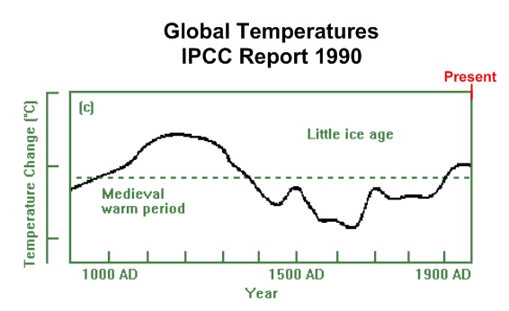 Now lets look at fossil fuel burning from 1910-1940 compared to the past 30 years. 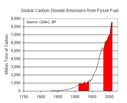 Quite a dramatic difference I'm sure you'll agree. If man's CO2 was to cause alarming or shocking warming, these two periods should show it. Agreed ? Now to my quiz. It shows the same two periods: 1910-1940 compared to the past 30 years. The latter is on the right ! 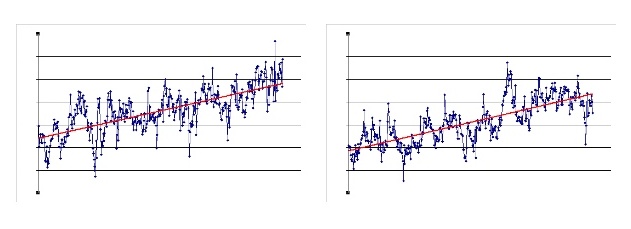 The correct answer is hence "(C)" ... there is no discernable difference in the rate of warming before and after man's increased CO2 production. It now should be obvious why Evan, the other alarmists here and the IPCC have found it impossible to find one shed of evidence to prove man's CO2 is causing warming ! There is none !! |
|||||
12:24:20 PM |
That's a pretty good trick Tony. You've managed to represent and interpret the IPCC data in the exact opposite way they did. | |||||
4:50:52 PM |
On 4/06/2009 TonyB wrote: >The correct answer is hence "(C)" ... there is no discernable difference >in the rate of warming before and after man's increased CO2 production. > how do you explain my graphs Tony? It definitely shows that it is warming faster in the latter period? |
|||||
9:39:34 PM |
On 4/06/2009 GravityHound wrote: >how do you explain my graphs Tony? It definitely shows that it is warming >faster in the latter period? Answer: Both the red line and the blue line appear to be for a period 10 years earlier than in Tony's graph. The red line misses the period 1930-1940 which on Tony's graph shows a rise in temerature. The blue line misses the last decade which has been a period of slight cooling from the 1999 El Nino peak. Just pointing out the obvious :) |
|||||
8:34:08 AM |
So what do all of these graphs mean to me? If you pick parts of the available data you can prove anything. As they say, there are “Lies, damned lies, and statistics” Me, I leave my climate sciences to the climate scientists, I'm either too dumb to read ALL of the data or smart enough to know that I wouldn't understand it if I did. So this this leaves me as the sucker in the conspiracy theories of global warming, but who is perpetrating them & why. The why has to be money it makes the world go round. The argument that its the researcher touting for grants does not hold up, as surely "big business" has a lot more money, hence a lot more of it to loose. Behind every good argument there is usually a grain of truth. does AGW exist? the "General" scientific consensus seems to be quite probable. Do we fully understand the science & the sverity of the effects behind it ? No! Me? I'm a trusting soul, I recycle & compost my waste, turn off the light when I leave the room & use public transport (except when going to Arapiles). If there's a chance of AGW happening a little effort now will save a lot of pain later |
|||||
11:09:45 AM |
Bad luck for you Tony, and persistent readers, I've run out of stuff to do at work. So, it's time again to nail some poorly constructed Climate Change Scepticism to a cross and set it on fire. On 4/06/2009 TonyB wrote: >Evan, >Lots more babble and nonsense in your posts that doesn't deserve a reply This is a good sign Tony, playing the man rather than the ball. It's a sign you're about to crack! I can feel it. You don't reply to my posts ever anyway, so I don't see why this should be any different. I think you're scared. I can smell the fear from here. >Firstly here's a graph from the IPCC. It shows how temperatures were >much higher than currently during the Medieval warm Period. Now, I know this is a harsh term, but I think you're pulling a furphy here. That graph is not from the IPCC. Would you mind giving me a link to where you got it? The only graph I could find from the IPCC is this one (Couldn't post it direct, because it is ENORMOUS) The IPCC tend to use funkier graphics than your pov B+W effort. Oh, and I just noticed, it stops at 1990 for some reason. Why exclude the last 18 years of data? You know we're well into the 2000's now, maybe that's your problem? All your arguments are based on 20 year old data. >Remember this is posted by the IPCC and politicians don't lie do they? Yeah they do, politicians lie like snakes in the sun. The IPCC are scientists though, so phew, dodged a bullet there. >Now lets look at fossil fuel burning from 1910-1940 compared to the past >30 years. Here's the actual IPCC version of the same sort of data, but for the last 10,000 years, and on more than one gas >Quite a dramatic difference I'm sure you'll agree. If man's CO2 was to >cause alarming or shocking warming, these two periods should show it. Agreed? Hmmm, I don't really agree with this statement. The temperature doesn't necessarily rise on the say the gas is emitted. It's like putting on a jumper. You don't get warm straight away, but the rate at which you store heat increases, until you reach a point where the rate you are storing it starts to beat the rate you're emitting it. This is the point the climate is at now. CO2's ability to store heat, in those awesome covalent bonds, is well proven, and the amount of CO2 in the atmosphere has clearly increased, ditto the other 'Kyoto' gases. So, we've put the jumper on, and the evidence that the heat is building is mounting. The same IPCC you have suddenly started giving scientific credibility to think that we've got heaps of jumpers on now, and we're going to get stinking hot in the future. > >Now to my quiz. It shows the same two periods: 1910-1940 compared to >the past 30 years. The latter is on the right ! >The correct answer is hence "(C)" ... there is no discernable difference >in the rate of warming before and after man's increased CO2 production. This is utter bullshiit. 'No discernable difference?' Put this in your narrative and smoke it. >It now should be obvious why Evan, the other alarmists here and the IPCC >have found it impossible to find one shed of evidence to prove man's CO2 >is causing warming ! There is none !! (hehe, you said 'shed' of evidence.) To summarise; you have disproven the IPCC, using 20 year old IPCC data, by graphing 2 periods, without axes (axiis? what's the plural of axis?) or any margins of error, or any real notion of where the data came from, nor any method. Presumably your special secret macro had some part to play. And that's it? Those 2 shiity graphs completely overturn a hypothesis that has been supported by every major economy and scientific body in the world, created over 30 years, and culminating in What breath taking, self-serving stubborness and stupidity. Your ideas are of course what I'm referring to Tony, not the individual. |
|||||
11:18:30 AM |
On 4/06/2009 TonyB wrote: >Lots more babble and nonsense in your posts that doesn't deserve a reply >but at least you have responded to my quiz ... so here's the answer ! > >Firstly here's a graph from the IPCC. It shows how temperatures were >much higher than currently during the Medieval warm Period. It also shows >the last 180 years of global warming since the Little Ice Age. yeah thats nothing new. the medieval warm period however is only a local effect, its not a measure of global temperature in that time period, regardless of what it says in the heading there. 1990 is archaic as far as climate science goes, try using something newer. and if you don't think its warmer now than it was before, consider that a lot of the ice pack thats being melted now hasn't thawed in a very, very long time. i don't know the numbers but its at least 10s or 100s of thousands of years, not since medieval times. |
|||||
12:11:50 PM |
On 5/06/2009 evanbb wrote: >>Firstly here's a graph from the IPCC. It shows how temperatures were >>much higher than currently during the Medieval warm Period. >Now, I know this is a harsh term, but I think you're pulling a furphy >here. That graph is not from the IPCC. I can assume you the graph was in the 1990 IPCC report. It was later seen as something of an embarassment as you can imagine. Perhaps this is the reason that the 1990 report is not available from the IPCC web site ... you have to buy it. >To summarise; you have disproven the IPCC, using 20 year old IPCC data, The data for the 1990 graph is 2000 years old. >by graphing 2 periods, without axes (axiis? what's the plural of axis?) The axes were deleted for the quiz. The abscissa is 1910 to 1940 on the first and 1989 to 2009 on the second. The ordinates for both graphs are in tenths of a degree. The important fact to draw from the graphs is that there is no increase in temperature rise due to man's fossil fuel burning. >or any margins of error, or any real notion of where the data came from, The data is from IPCC/Hadley?UK Met Office, as given in my earlier link. The data tables do not include errors, however it does include a link to a paper which discusses errors ... this paper contains serios errors. The station data study link I provided gives a much more realistic indication of data errors. >Those 2 shiity graphs completely overturn a hypothesis that ... Exactly. They overturn a hypothesis that man's CO2 is causing warming. There is no evidence to the contrary. As have said many times, please show me if you can find any. There's actually many thousands of scientists producing lots of other shitty graphs highlighting the rubbish of the IPCC hypothesis. Here's another shitty graph for you showing the nonsense of the IPCC forecasts, that are the basis for a recommended new tax on every Australian Taxpayer of $2056 PER ANNUM (Productivity Council of Oz). 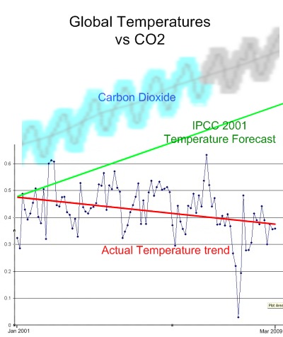 |
|||||
1:48:51 PM |
On 5/06/2009 TonyB wrote: >Here's another shitty graph for you showing the nonsense of the IPCC forecasts, well I have to agree with you there, it is a shitty graph. no references & DIY labels & done by someone who doesn't know what a line of best fit is. here's another chart showing the broader trend:
(from http://www.nasa.gov/centers/goddard/news/topstory/2006/2006_warm.html ) |
|||||
1:59:46 PM |
G'day TonyB, I am no guru on the subject but am interested in your opinion of the following with respect to your latest post graph and the subsequent one by anthonyk. Although your graph is 2001-2009, how do you think it relates to say the 1989-1994 five year trend portion of anthonyk graph, when compared to temperatures generally in it for pre 1940, or even period 1940-1980? |
|||||
4:08:36 PM |
On 5/06/2009 evanbb wrote: >>Firstly here's a graph from the IPCC. It shows how temperatures were >>much higher than currently during the Medieval warm Period. >Now, I know this is a harsh term, but I think you're pulling a furphy >here. That graph is not from the IPCC. Would you mind giving me a link >to where you got it? The only graph I could find from the IPCC is this one (Couldn't post it direct, >because it is ENORMOUS) > >The IPCC tend to use funkier graphics than your pov B+W effort. > >Oh, and I just noticed, it stops at 1990 for some reason. Why exclude >the last 18 years of data? You know we're well into the 2000's now, maybe >that's your problem? All your arguments are based on 20 year old data. I think Tony is using the IPCC 1990 graph because it includes the medieval warming period and little ice age. I always thought the timing was a little too 'convenient' when these were discarded in later reports to flatten out the last 1000 years. >>Now to my quiz. It shows the same two periods: 1910-1940 compared to >>the past 30 years. The latter is on the right ! >>The correct answer is hence "(C)" ... there is no discernable difference >>in the rate of warming before and after man's increased CO2 production. > >This is utter bullshiit. 'No discernable difference?' >Put this >in your narrative and smoke it. > Looking at the IPCC graphs you've posted, there still appears to be very little discernible difference in the slope of the temperature line between the two time periods 1910-1940 and 1979-2009. |

| There are 818 messages in this topic. |
Home | Guide | Gallery | Tech Tips | Articles | Reviews | Dictionary | Forum | Links | About | Search
Chockstone Photography | Landscape Photography Australia | Australian Landscape Photography | Landscape Photos Australia
Please read the full disclaimer before using any information contained on these pages.
Australian Panoramic |
Australian Coast |
Australian Mountains |
Australian Countryside |
Australian Waterfalls |
Australian Lakes |
Australian Cities |
Australian Macro |
Australian Wildlife
Landscape Photo |
Landscape Photography |
Landscape Photography Australia |
Fine Art Photography |
Wilderness Photography |
Nature Photo |
Australian Landscape Photo |
Stock Photography Australia |
Landscape Photos |
Panoramic Photos |
Panoramic Photography Australia |
Australian Landscape Photography |
High Country Mountain Huts |
Mothers Day Gifts |
Gifts for Mothers Day |
Mothers Day Gift Ideas |
Ideas for Mothers Day |
Wedding Gift Ideas |
Christmas Gift Ideas |
Fathers Day Gifts |
Gifts for Fathers Day |
Fathers Day Gift Ideas |
Ideas for Fathers Day |
Landscape Prints |
Landscape Poster |
Limited Edition Prints |
Panoramic Photo |
Buy Posters |
Poster Prints